One script, every style: what changed and what broke
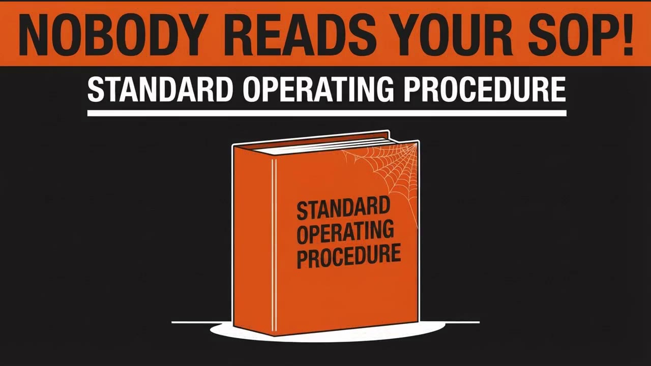
[title] Nobody reads your SOP

[scene 1]
[voice] Nobody reads your fourteen-page standard operating procedure.
[caption] NOBODY READS YOUR SOP!
[drawing] A thick ring binder standing spine first so the thickness reads, one top corner covered in cobwebs. Printed on the spine, exactly and only these words: STANDARD OPERATING PROCEDURE. Those words are the only letters in the frame: no other labels, no numbers, no bars, no panels, no toolbars. No people, no hands, no figures. Objects only. Plenty of empty ground around the binder. One accent colour.

[scene 2]
[voice] You cannot flip through a binder while holding a scanner.
[caption] CAN'T FLIP PAGES
[drawing] The same ring binder, now open, sliding off the edge of a wooden pallet with its pages fanning out, and a handheld barcode scanner lying flat beside it. Nobody is holding anything. No people, no hands, no figures. There are no letters anywhere in the frame: no labels, no numbers, no bars, no panels. Objects only.

[scene 3]
[voice] Three things fix that. One: one procedure, one job.
[caption] 1. ONE PROCEDURE, ONE JOB
[drawing] A direct side by side comparison split by one thin vertical rule. On the left a single thin sheet of paper carrying one heading rule and three short ruled lines, the rest of the sheet empty, and centred under it the caption ONE PROCEDURE. On the right the same thick ring binder from the opening, visibly taller than the sheet, and centred under it the caption ONE JOB. Those two captions are the only letters in the frame. Nothing else is in the frame: no icons, no icon labels, no numbers, no horizontal bars, no toolbars, no address bars, no buttons, no brackets. No people, no hands. Objects only.

[scene 4]
[voice] Two: every step starts with a verb.
[caption] 2. EVERY STEP STARTS WITH A VERB
[drawing] A clipboard holding a sheet with exactly three rows. The first word of each row is in capitals and underlined in the accent colour, and those words are exactly SCAN, CHECK, SIGN, one per row, in that order. The rest of each row is a short neutral rule standing in for text. Those three words are the only letters in the frame: no other labels, no numbers, no bars, no panels. No people, no hands. Objects only.

[scene 5]
[voice] Three: if a step needs a picture, give it one.
[caption] 3. IF IT NEEDS A PICTURE, GIVE IT ONE
[drawing] Two sheets of paper of the same size, upright and side by side, together filling the frame with equal margins. The left sheet carries three short ruled lines of instruction text and nothing else. The right sheet carries the same three ruled lines plus, in the middle of the sheet, a simple drawing of a handheld barcode scanner aimed at a cardboard box. There are no letters anywhere in the frame at all: no headings above the sheets, no labels under them, no numbers, no callout circles, no charts, no icons, no badges, no arrows, no brackets, no corner marks. No people, no hands.

[scene 6]
[voice] Same document. Two minutes. The filled template is on explain dot ink.
[caption] explain.ink/templates/sop
[drawing] The same ring binder from the opening, the cobwebs now gone, standing on the left with the caption THE MANUAL centred under it. On the right a plain rectangle shaped like a video frame with a small play triangle inside it, and the caption THE TEMPLATE centred under it. The two objects are the same height. Those two captions are the only letters in the frame: no other labels, no numbers, no bars, no panels, no buttons. No people, no hands. Objects only.
Paste it into Studio with Use my words exactly, pick the style, and you get this video back.
One text about a procedure nobody reads went into the studio once. Every video below is that same text drawn again in a different hand. The words on screen, the beats and the running order are identical. Only the drawing changes.
This is the honest version of that experiment, including the parts that came out wrong.
Why run one script through several styles?
Because a style is not decoration. It tells a viewer what kind of document they are looking at before a word is heard. An orange safety placard reads as a rule that gets enforced. A blueprint reads as a system somebody designed. A pale deck reads as a report that will be presented on Monday. The sentence is the same in all three. The promise is not.
The second reason is duller and more useful: we wanted to know whether one script can be reused across looks at all, or whether each look needs its own writing.
What went into the studio
The script was written once, in plain text. The lines that had to appear on screen were given exactly rather than described, because a described line comes back as invented nonsense. People were forbidden in the frame, in the brief for every scene, because the subject is documents and equipment.
The narration, in full:
Nobody reads your fourteen-page standard operating procedure. You cannot flip through a binder while you are holding a scanner. Three things fix that. One: one procedure, one job. Two: every step starts with a verb. Three: if a step needs a picture, give it one. Same document. Two minutes. The filled template is on explain.ink.
Nothing in that text was changed between runs. The full input, scene by scene, with the drawing brief for each one, is in the box above.
What held
The on-screen lines came out word for word in every run. SCAN, CHECK and SIGN are the same three words on the same three rows in all of them, which is the thing that used to break.
The ban on people held everywhere, including in a style whose own name promises figures in hard hats. The brief beat the style, which is the answer to a question we had been arguing about: the look is a setting, and the writing is still in charge.
Recurring objects stayed themselves. The binder in the opening is recognisably the same binder in the closing shot, in every style, without being described twice.
What did not hold
The pacing drifted. One run came back three seconds shorter than the others and its beats had slid, so by the middle of the video it was already a caption ahead. Same input, different cut. So a script is reusable across styles, but the timing is not something you can assume.
Two runs dragged in furniture from a template that has nothing to do with this video: a module number in one corner and a course banner along the bottom. Three videos in three unrelated styles showed the same intrusion, which makes it a template leaking through rather than a style misbehaving.
One opening caption came back doubled, the headline printed twice with the second copy trimmed. Another leaked a fragment of the spoken sentence into the caption, so a line of narration appeared as a subtitle that was never meant to be read.
What we would write differently
Give the caption for every scene as an exact string, including the closing one, and never let a scene inherit its caption from the narration. State the running time per scene rather than for the video, so a shorter cut shows up as a broken rule instead of a shrug. And check the first frame of the first scene before anything else: it is the frame that becomes the thumbnail, and it is the frame most likely to still be drawing itself.
Try it on your own procedure
Take a procedure your team already has, write the on-screen lines out exactly, and run it twice in two different looks. The comparison tells you more about your own document than any guide will.